Economic News

Economic News

Why Trade Uncertainty – Illustrated

Here’re the Baker-Bloom-Davis categorical trade policy uncertainty measure and the Caldara et al. Trade Policy Uncertainty index. Why are these measures elevated? In my mind, why aren’t they even higher? Figure 1: EPU-trade category (blue, left scale), and Trade Policy Uncertainty index (red, right scale). Source: Baker, Bloom & Davis policyuncertainty.com, and Caldara et al. TPUD.  Trade policy is definitely high. In a longer time horizon context: Figure 2: EPU-trade category (blue, left scale), and Trade Policy Uncertainty index (red, right scale). NBER defined peak-to-trough recession dates shaded gray. Source: Baker, Bloom & Davis policyuncertainty.com, Caldara et al., and NBER. Are the textual analyses catching something that’s a figment. I don’t think so. Hatzius/Goldman Sachs graphically illustrates the possible outcomes under certain scenarios. Source: Hatzius, “Global View: Stall Speed,” Goldman Sachs, July 21, 2025. Another perspective on the sources of uncertainty is the TACO phenomenon, as graphically illustrated by Richard Baldwin (for the EU, below): Source: Richard Baldwin.  

Economic News

Guest Contribution: “Recession Detection Along the Anticipation-Precision Frontier”

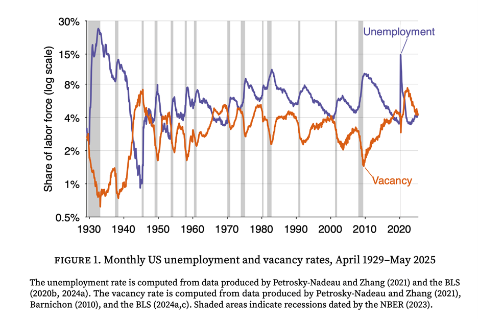
Today we are fortunate to present a guest post written by Pascal Michaillat (UCSC).  Is the U.S. economy in a recession? While economists debate and official announcements lag, a new algorithm that I have developed, based on a systematic analysis of labor market data, gives a 71% probability that the US economy was in a recession as of May 2025. The recession might have started as early as late 2023 or mid 2024. Timely recession detection is critical for an effective policy response, yet the official declaration from the NBER’s Business Cycle Dating Committee often arrives up to a year after a recession has begun. Intriguingly, while the NBER’s webpage prominently displays the US unemployment rate over time, the explanation of how recession dates are determined does not mention that the dating committee uses the unemployment rate at all. For policymakers, businesses, and households who need to make decisions in real time, this delay is impractical. But existing real-time indicators that track the unemployment rate, like the Sahm Rule, provide valuable early signals. However, the Sahm and related rules are based on a single, sometimes noisy, measure of the economy. This algorithm builds on the insight that combining labor market data can create a less noisy, more powerful signal. In previous work with Emmanuel Saez, we developed a rule that combined unemployment and vacancy data to detect recessions more quickly and robustly than indicators based on unemployment alone. The foundation of this work is the Beveridge curve: at the onset of every recession, unemployment rises sharply just as job vacancies fall.     This new algorithm takes the next logical step: instead of using one specific formula to filter and combine the data, it systematically searches for the optimal way to do so. The goal is to find the best possible lens to view this data. The algorithm first generates millions of potential recession classifiers, each processing the unemployment and vacancy data in a unique way, and each using a unique recession threshold. The algorithm then subjects them to a simple but demanding test: to survive, a classifier must identify all 15 US recessions from 1929 to 2021 without a single false positive. This test leaves us with over two million historically perfect classifiers. Having millions of perfect classifiers creates a new challenge: which one to choose? To solve this, the algorithm evaluates classifiers on two key dimensions: how early they detect a recession (anticipation) and how consistent that signal is (precision). By plotting each classifier’s average detection delay against the standard deviation of the detection delay, the algorithm identifies an anticipation-precision frontier—a group of elite classifiers that offer the optimal trade-off between speed and accuracy. For any given level of precision, no classifier is faster than one on this frontier. From this frontier, the algorithm then selects an ensemble of  7 top-performing classifiers. These are all the classifiers whose detection delay’s standard deviation is below 3 months—which guarantees that the width of the  95% confidence interval for the estimated recession start date is less than 1 year. This classifier ensemble provides a single, real-time recession probability. In every historical recession since 1929, the probability rises sharply near the downturn’s start and stays high until it ends. When I apply the model to the most recent data, it says that the probability of a recession has surged to 71% as of May 2025. This is not a statistical abstraction; it is a direct result of the weakening of the labor market. Since mid-2022, the combination of rising unemployment and falling vacancies has triggered 5 of the 7 classifiers in the ensemble, pushing the recession probability up. The recession probability first became positive late in 2023, when 3 of the 7 classifiers got triggered. The recession further increased in mid 2024, when 2 additional classifiers got activated. Currently, only 2 of the 7 classifiers in the ensemble are inactivated. To verify the model’s reliability, I performed a series of backtests. For instance, I trained the algorithm using data only up to December 1984 and asked it to detect all subsequent recessions. All the classifiers in the ensemble built from 1929–1984 data did very well, correctly identifying all four downturns in the 1985–2021 test period—including the dot-com bust and the Great Recession—without any false positives. Most impressively, even without seeing any data past 1984, the classifier ensemble detected the Great Recession in good time, with its recession probability surging by the summer of 2008, providing a clear and timely warning. In fact, The performance of the algorithm over the entire testing period, 1985–2021, is surprisingly good. Over the 4 recessions of the testing period, the standard deviation of delays averages only 1.4 months, and the mean delay averages only 1.2 months. The classifier ensemble trained on 1929–1984 data assigns a recession probability of 83% to current data (5 of the 6 classifiers in the ensemble are currently triggered). Overall, this new algorithm shows that the labor market is sending an unambiguous signal: the conditions characteristic of a recession are not on the horizon—they are already here. If it turns out, once the dust has settled, that the US economy is not in a recession: what would we learn? In that case, the algorithm could be retrained on the new data, and the classifiers that mistakenly detected the recession would be eliminated. However, given that many of the classifiers on the frontier do signal a recession, the anticipation-precision frontier would shift out. We would therefore learn that detecting recessions with labor market data is harder than we previously thought.   This post written by Pascal Michaillat.  

Economic News

“Groceries” under Trump

ERS predicts 2.2% increase in food-at-home prices in 2025. Figure 1: CPI food-at-home (black); ERS forecast of January (light blue square), ERS forecast of March (red triangle), ERS forecast of June (inverted green triangle). Source: BLS via FRED, ERS, and author’s calculations. While food-at-home inflation has decreased, it still remains the fact that grocery prices are rising — not falling. Further PPI-food manufacturing continues to rise, so we can be reasonably confidence of continued grocery price increases.    

Economic News

CEA: “Imported Goods Have Been Getting Cheaper Relative to Domestically Produced Goods”

That’s the title of a report by the Trump administration CEA earlier this month. It’s an interesting question whether this is the relevant question or not. What the CEA analysis does is to use the 2017 Input-Output tables to determine what the final goods prices (in CPI or PCE deflator) do, taking into account the amount of imports used in each category. This seems like a reasonable way to proceed, until one thinks about how tariffs work. Consider the simplest case, where the US is a small country. Source: Chinn and Irwin, International Economics (2025). Then using the methodology of the Trump CEA, the importance of tariffs for final demand prices is denoted by M×(Pw(1+τ)-Pw.) [I hold import quantity at pre-tariff level M because CEA uses 2017 IO tables]. However, as is known from basic economics (like the kind one learns in first course econ in undergrad, or even high school), import competing domestic firms also raise their prices. Hence, the prices are raised for quantity M, as well as quantity Qs.  In the figure above, this doesn’t change much. However, consider an alternative, where domestic production is much larger relative to imports: Now, price increases apply to quantities 0 to Qs and M. In other words, a much larger share of final production. In other words, the CEA calculations are ignoring the presence of domestic alternatives. For some products (think coffee), there is virtually no domestic production. But for others, there are. Consider steel — Nucor raised their prices when tariffs were announced, even before they were implemented. By the way, if the imported goods are durables, I would expect that domestic, import-competing firms would raise their prices before tariffed goods entered (recall, the universal 10% tariff was only implemented in April, and the CEA analysis applies to final prices through May). The CEA report cites a Fed analysis which uses similar methodology to theirs. I will merely observe that in the case of imported Chinese goods, there are fewer import-competing domestic firms, so the preceding critique need not apply as forcefully.

Economic News

EJ Antoni on the No Tariff Pass Through Thesis

From Heritage Chief Economist EJ Antoni on X: N.B.: this is an INDIRECT indicator of tariffs not being passed on b/c import prices have fallen relative to their domestic counterparts; that’s the result of a substitution effect and foreign producers’ attempt to retain market share by reducing their prices relatively speaking: · Jul 17 Import prices just came in WAAAY below expectations: June was up just 0.1% M/M, -0.2% Y/Y, while May saw a huge downward revision from flat to -0.4% M/M; still waiting for tariffs to be passed on by foreign producers… Note that Dr. Antoni is apparently using the all commodity imports price index. I think that, since no tariffs have been applied to oil, it would be more appropriate to use the import price index ex-petroleum. Using this index, and Instead of plotting rates of change, I show price indices relative to 2025M04, given that the 10% tariffs were effective in early April. Figure 1: Import price index for all commodities (blue), for commodities ex-petroleum (tan), all in logs 2025M04=0. Source: BLS via FRED, and author’s calculations. Using this more appropriate series, I do not see the price decrease the Dr. Antoni refers to. As an aside, I am still waiting for Dr. Antoni to declare the end of the recession he claimed started in 2022.  

Economic News

Thanks, Drumpf

WSJ mean survey forecast relative to 2023-2024 trend. Figure 1: GDP (bold black), 2023-2024 stochastic trend (blue), WSJ July mean (tan), WSJ 20% high/low band (gray lines), GDPNow of 7/17 (light blue square), all in bn.Ch.2017$ SAAR. Source: BEA, WSJ, Atlanta Fed, and author’s calculations.

Economic News

Economic Policy Uncertainty and Economic Uncertainty

Policy uncertainty has remains high; does it matter for economic uncertainty? Figure 1: EPU-trade category (blue, left scale), and Trade Policy Uncertainty index (red, right scale). Source: Baker, Bloom & Davis policyuncertainty.com, and Caldara et al. TPUD.   Figure 2: EPU (blue, left scale), and centered 7 day moving average (red, right scale), SF Fed News Sentiment index (green). Source: policyuncertainty.com, SF Fed, and author’s calculations.   Figure 3: EPU (legacy) (blue, left scale), Jurado, Ludvigson, Ng (JLN) macro uncertainty index (tan, right scale). NBER defined peak to trough recession dates shaded gray. Source: policyuncertainty.com, Ludvigson, and NBER.    Figure 4: EPU (legacy) (blue, left scale), Jurado, Ludvigson, Ng (JLN) financial uncertainty index (tan, right scale). NBER defined peak to trough recession dates shaded gray. Source: policyuncertainty.com, Ludvigson, and NBER.  In a bivariate setting, one rejects the null hypothesis that JLN Granger causes EPU, but one can not reject the null hypothesis that EPU causes JLN, at conventional levels. As of April (the last available observation), the JLN-macro series was over one standard deviation above the mean. And JLN (AEJ-Macro, 2021) suggests that financial uncertainty is an exogenous determinant of the business cycle activity.  

Economic News

Tariffs in the Data

From CPI, note the CPI furniture and appliances category: Figure 1: CPI all urban (blue), CPI commodities (green), and CPI – furniture and household appliances (tan), all in logs, 2025M01=0. Source: BLS, and author’s calculations. And, on a much more granular level, from Cavallo et al. (July 17, 2025): Source: Cavallo,  et al. (July 17, 2025). Not only have tariffed goods prices risen, domestic competitor prices have as well. Thanks, Drumpf!  

Economic News

Business Cycle Indicators – Industrial, Manufacturing Production, Retail Sales

Up for all three, although production essentially flat since February, and real retail sales down since March. Indicators followed by the NBER’s BCDC in Figure 1: Figure 1: Nonfarm Payroll incl benchmark revision employment from CES (bold blue), civilian employment using smoothed population controls (orange), industrial production (red), personal income excluding current transfers in Ch.2017$ (bold light green), manufacturing and trade sales in Ch.2017$ (black), consumption in Ch.2017$ (light blue), and monthly GDP in Ch.2017$ (pink), GDP (blue bars), all log normalized to 2021M11=0. 2025Q1 GDP is third release. Source: BLS via FRED, Federal Reserve, BEA, S&P Global Market Insights (nee Macroeconomic Advisers, IHS Markit) (7/2/2025 release), and author’s calculations.  Alternative business cycle indicators: Figure 2: Preliminary Nonfarm Payroll early benchmark (NFP) (bold blue), civilian employment adjusted to NFP concept, with smoothed population controls (orange), manufacturing production (red), real retail sales (black), and coincident index in Ch.2017$ (pink), GDO (blue bars), all log normalized to 2021M11=0. Source: Philadelphia Fed [1], Philadelphia Fed [2], Federal Reserve via FRED, BEA 2025Q1 third release, and author’s calculations.

Scroll to Top